")

When you think about optimizing your website in order to increase conversions, what’s the first thing that springs to your mind? Allow me do some mind reading here: maybe improving the layout? Or tweaking the CTA buttons? Perhaps enhancing the on-site experience? That would be swell. What if I told you that there are some itsy-bitsy parts still left (like the “insignificant” bits of wording inside the signup form) that can switch your skeptical visitors into confident buyers. Yep, no magic included. Just pure and efficient web form micro-copy, designed and set in the right context.
 Author: Alexandra Recasan is a PR specialist with 123ContactForm, the form and survey builder that helps businesses streamline their feedback-gathering and other marketing processes. She works with small businesses and educational institutions on building their forms for data gathering, information management and more.
Dissecting the web form: Start with the head. Go for the lines.
When it comes to web forms copy, as you already know, there are some specific elements included. Namely: a headline, subheads, field copy, button copy and privacy policy. When designing your form, everything is interconnected. You can’t isolate just one element.
Let’s start with the headline. No science fiction insight concerning this matter, just a well-known and sound advice that is often ignored: make the headline easy to read and point out the benefit, not the action. Yes, you still have to use imperative wording but always choose one that answers the question, “What’s in it for me?”
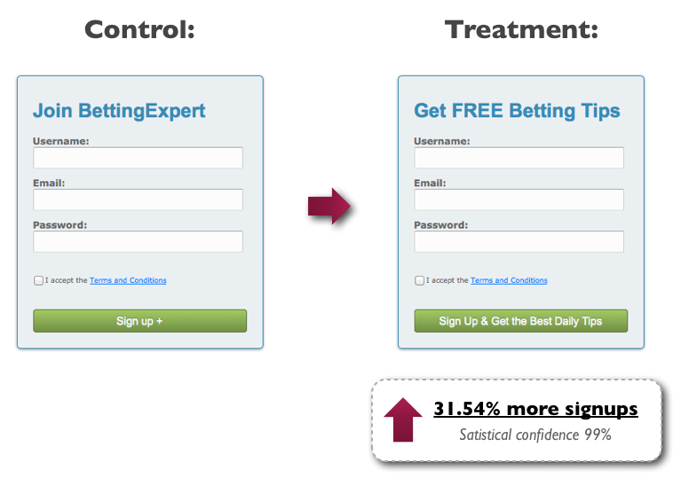
Michael Aagaard from Content Verve conducted an experiment with the signup form for a betting company. The optimization goal? Increase the number of signups/new members.
The primary structure of the form included a headline that stated “Join BettingExpert”—an explanatory but plain copy that didn’t convey value and relevance. In order to change that, the copy tweak focused on answering the crucial question “Why should I fill out this form?” Asking the right question leads to the right wording, and the right wording leads to, you guessed it, leads. Particularly, this minor change turned into a 31.54% increase in signups.
Reinforce your main idea through subheads
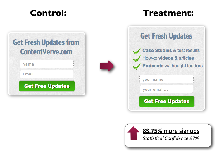
A straight-to-the-point and compelling headline is neat, but it cannot stand alone. Bring out the big guns by reinforcing the key benefits of your offering, just before the visitors have to enter their details. A short phrase or 3 to 4 bullet points will play their part in reducing so-called form-related anxiety. Coming back to examples, we once again bring in Michael Aagaard, who this time tested the effect of adding some extra body copy to his blog signup form. Of course, not just any body copy, but some specific bullet points below the headline that boost interest. The result? The additional copy increased signups by an incredible 83.75%.
Harvest the form fields with right words
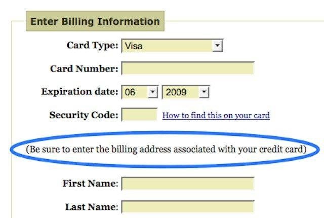
Form filling should be as easy as pie. It should be intuitive, alleviate friction and be time-efficient. Otherwise, chances are your potential customers will just add to your bounce rate or provide erroneous information. That was the well-known case of Joshua Porter for an eCommerce project he was in charge of. He created a checkout form asking for billing information. All well and good until bundles of error notifications came, announcing that transactions were failing because the addresses people were entering didn’t match the ones on their credit card. By simply adding a short and explanatory micro copy, the process came back to normal and errors went away.
Make your form buttons call the action
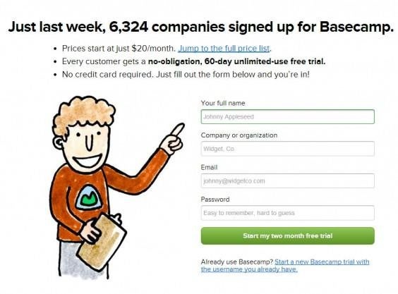
The most common mistake that is made in designing a Call To Action for a form button is the lack of clear-cut copy. “Buy now,” “Download,” “Click here,” “Submit.” Really? Why’s that? Even if the CTA is set in the right context (having all around explanatory text) restating and resuming the main idea enhances the click impulse. One good example of bringing theory to practice is the button designed for the register form on Basecamp. No mystery in here, no second guesses—what you read is what you get.
Build up confidence with the “Privacy policy”
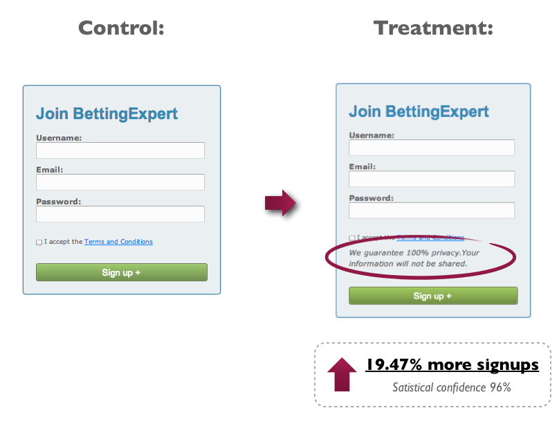
Since we’re still waiting for the days when spam will be a thing of the past and everybody will fill out forms without having the slightest fear of receiving such a dreadful thing, let’s take into consideration a “Privacy policy” to insert into your web form. Tucking in a privacy policy is of best intentions, but make sure your intentions are properly worded. One of the A/B tests managed by Content Verve showed that the simple reassurance of not receiving spam wasn’t efficient at all. On the contrary. Having the word “spam” inside it—100% privacy, we will never spam you—led to 18.70 % fewer signups. Imagine we are that sensible. Given this situation, the copy hack embodied a whole different wording that claimed 100% privacy and information not being shared. The signups increased by 19.47%. Take a glance below.
There’s one thing to keep in mind, beside all best practices insights, of web forms micro-copy: improving your web forms micro-copy won’t play magic tricks on conversion, but will definitely play its part in offering a better user experience.
Author: Alexandra Recasan is a PR specialist with 123ContactForm, the form and survey builder that helps businesses streamline their feedback-gathering and other marketing processes. She works with small businesses and educational institutions on building their forms for data gathering, information management and more.
Published: December 9, 2014
3685 Views
3685 Views
Trending Articles


Stay up to date with